The Color of Photography Prints
Warning, this is a technical, techie discussion on color.
Since joining the Art By the Sea Gallery, I have been making myself aware of the color of metal prints, a new form of image presentation versus the more traditional form of giclee (inkjet) prints. Interestingly, the term Giclee is a French term meaning “to spray” and represents to inkjet process of spaying ink on the medium used in the printer. However, not all inkjet prints fall into the category of being a giclee print. It is necessary for the image to be of a high enough quality (megapixels) to produce a print density of at least 300 dots per inch, dpi. However, the most important element is the color handling quality of the medium used to print and display the image.
Before I get into discussion what I mean by that last statement, let's begin by talking about color space, color profiles, icc profiles and color gamuts. All visual electronic mediums use an a method of describing the color displayed or printed through a process called "color management."Color management (or colour management) is the controlled conversion between the color representations of various devices, such asdigital cameras, monitors, TV screens, film printers, computer printers offset presses, and corresponding media. Each device has its unique way of describing its color and the management process is to take the color as described from the digital camera and convert that information an display it on a computer monitor accurately. The process may sound easy but the actually process is very nuanced.
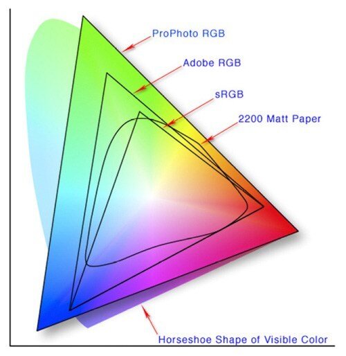
From this excellent presentation of the colors used in photography, we can begin the more detailed discussion. First of all, as the above chart describes, the horseshoe shape is the visible light that the average person can see, which is about 10 million different colors. The next subset, or gamut, is ProPhoto RGB. This is the largest color space that photographers can work with. There are pros and cons to its use as we will discover later. The next one, Adobe RGB has become pretty much the standard today. Most high end computer monitors have a color gamut almost equivalent to this color space and some inkjet printers can achieve color outputs close this this gamut. The last one, sRGB is smallest of the standard gamuts and it has been the color space that the internet operates on. With better monitors and the ability to post images in Adobe RGB the internet is gradually move to a larger color gamut. but generally speaking, one should assume they are viewing images and pictures defined by sRGB.
Photographers have different opinions on which color space to work with. Some like me, chose to work with the largest, ProPhoto with the idea that we can alway drop down to small ones but once color is thrown out, one cannot go back. Others prefer to work in Adobe RGB, reasoning that this is the space were they can discern what its output will look like. Regarless, most images that are posted to the internet, particularly on Facebook will be downsampled to sRGB.
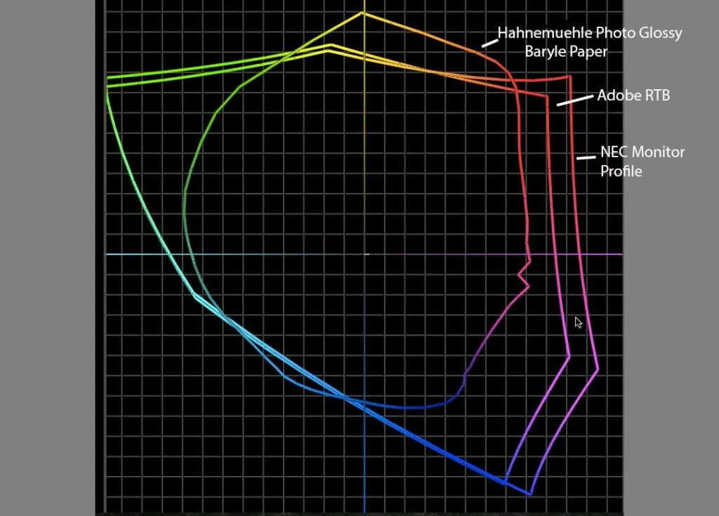
In the above graph we have three ICC Profiles, Adobe RGB, the color profile for my NEC monitor and the color profile (specifications) for Hahnemühle's Photo Glossy Baryta Printing paper for one of my Epson printers. As you can see, this graph is a good reason to work with ProPhoto RGB. If I worked with Adobe RGB I would have eliminated some of the hues in the yellow/orange/red areas in a print and I would have cut down some of the color I could have seen.
So now we come to the crux of this post. I have been increasingly aware of the popularity of metal prints and so I sent some prints out to a couple of different, well known vendors and even though I was careful on my color management of these prints I came away a little disappointed in their results, particularly since I am providing these images to customers and I wanted to make sure the final product looked like those I had posted on my web sites. So to see what was going on, I sent some color targets to these vendors and created my own color profiles. To my great surprise I was very surprised at how small their color gamut was as demonstrated above. I suppose I should not have been surprised, as the process of creating a metal print involves first printing the image on a medium that is intern transferred to metal. In that transfer process, hues and saturations are lost. These prints work fine when there are strong primary colors, perhaps like the image I used for this post, but when one wants a rich complicated image, there is nothing that can beat a good giclee print, particularly under museum non-reflective glass.
Earl


